Old Identity

Introduction
Ladies and gentlemen, boys and girls, gender fluents, and all you lovable creatures and whimsical beings…
How do you update a circus logo that is beloved by all kids in Denmark? The logo must remain recognizable to children, even those who cannot read, and in the best of all worlds they only sense that something is new, but trust that Cirkus Summarum is just as great and lovable as always because it is crucial that Cirkus Summarum retains its charm.
Additionally, the updated logo must be versatile, working well across various touchpoints, including vector, one-color, and animated versions.
Fortunately, we share the children's love for Cirkus Summarum and we are extremely proud and humble that the Muscular Dystrophy Foundation (who owns Cirkus Summarum) trusted us with updating one of Denmark's most cherished brands.



Wordmark
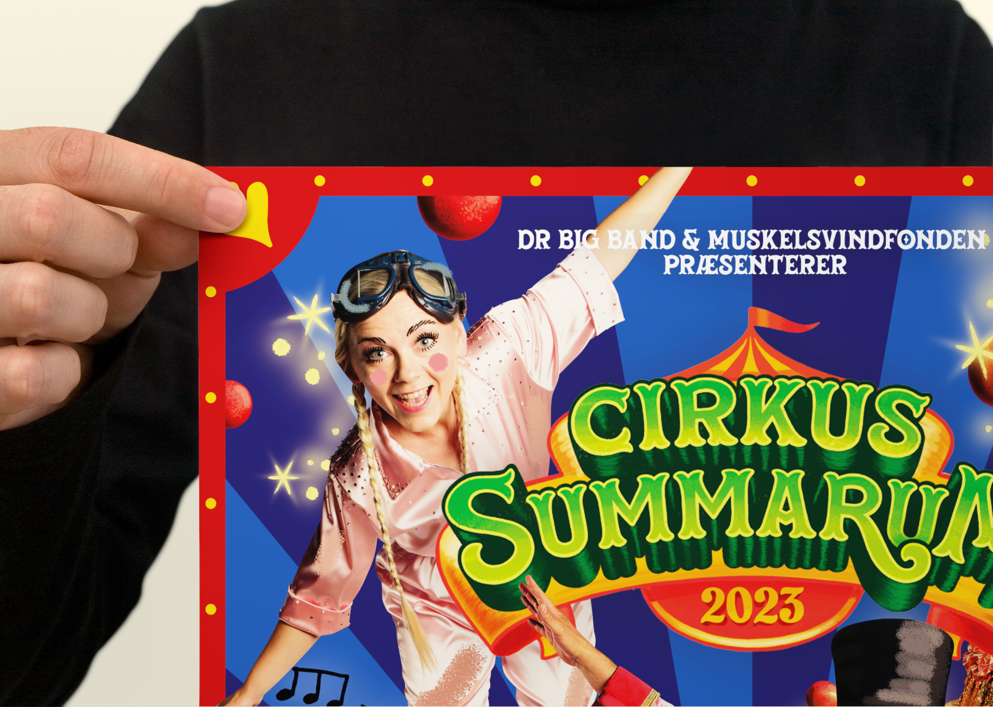
The main logo is hand-drawn, which serves as both a homage to the old logo and a means of conveying that the characters that children always see on TV are now tangible and real. Tactility might be Cirkus Summarum's primary differentiator.
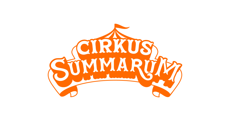
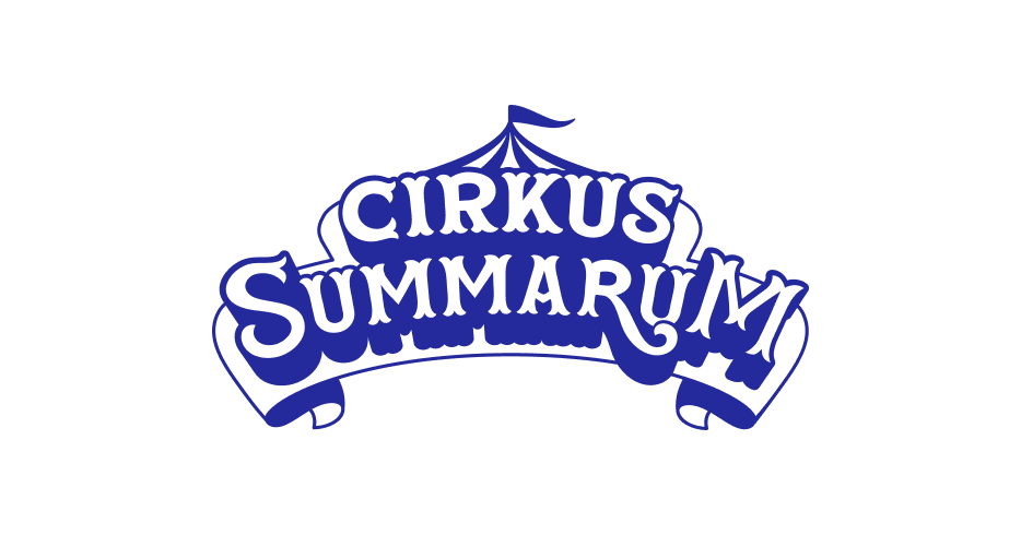
Though our primary logo is hand-drawn, we do have a multicolor vector version of the logo that we use in low-resolution cases or, like here, in motion. This version is mostly used on tv spots, why its also containing Ramasjangs’ rainbow.
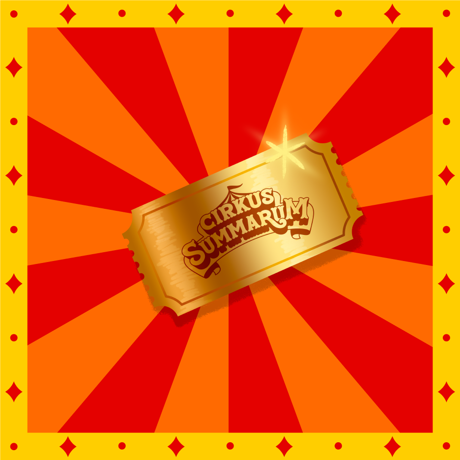
The centered nature of the logo mark makes it perfect for circus contexts such as posters, entrances, tickets, and more. The little circus tent top in the background also helps kids recognize it as a circus logo.



Toolbox
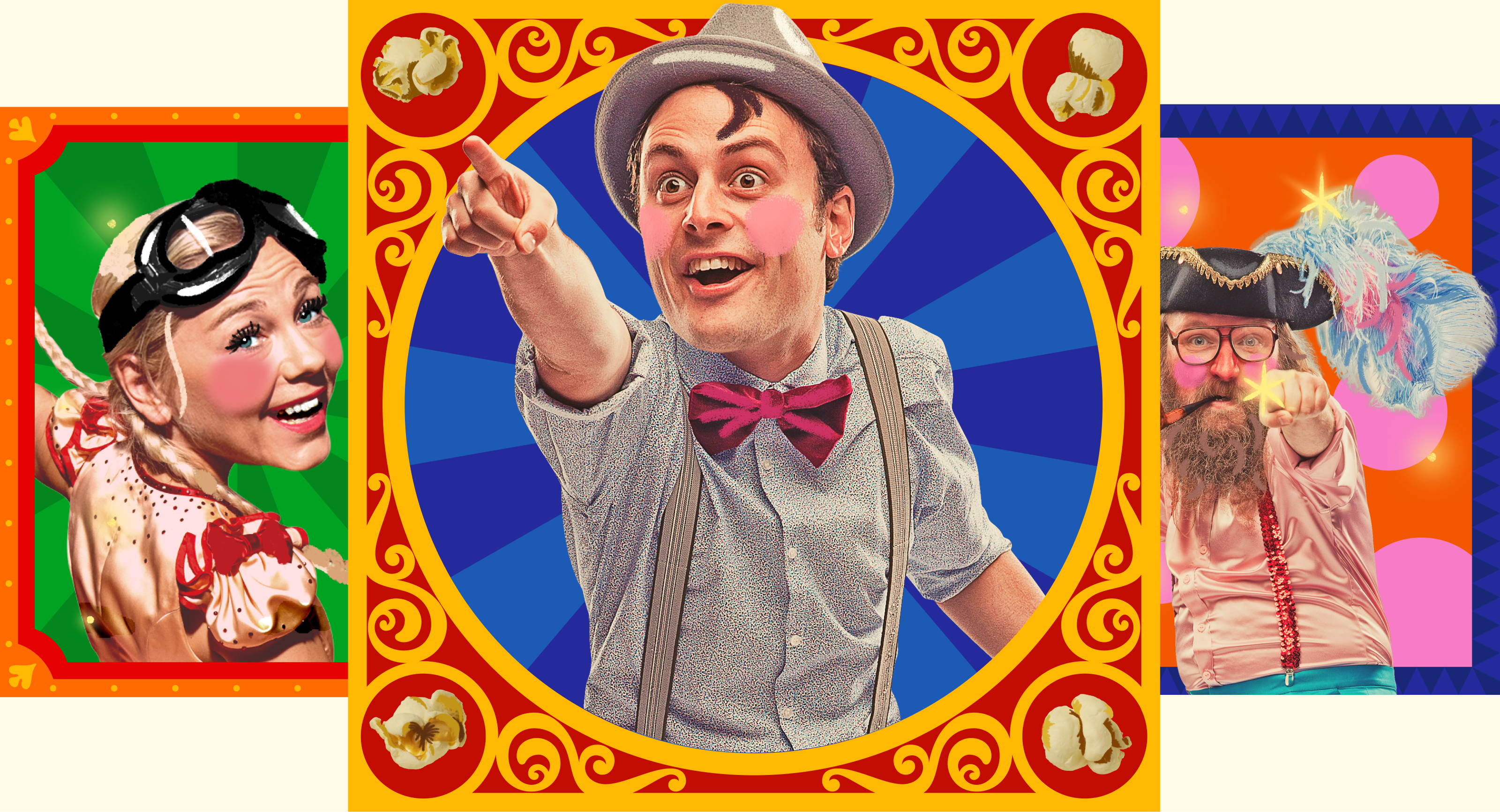
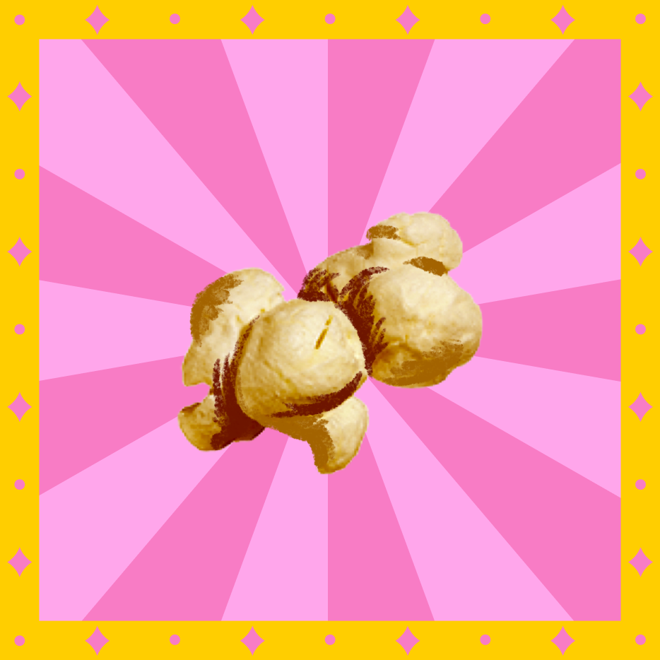
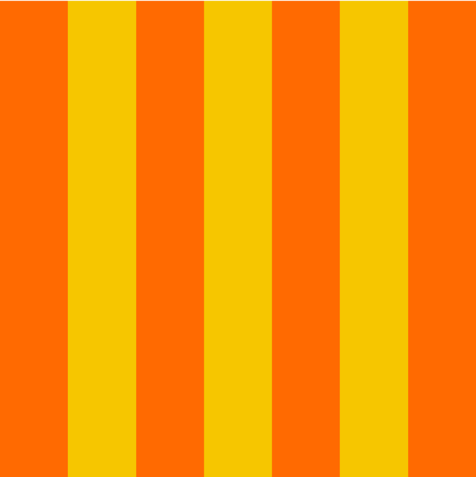
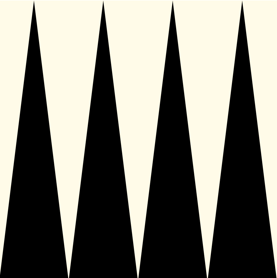
For the Cirkus Summarum identity, we also designed an extensive toolbox containing a set of bright and saturated colors, six different circus patterns, and a toolbox for creating frames. The combination opportunities are countless.
Additionally, there was a need for a set of icons. However, instead of following the classic vector approach and considering the addition of new elements each year, we opted for using images and adding an illustrated layer, utilizing the same brush.
as on the logo mark. The same technique is used on the artists. The result is a unique and recognizable style that quickly sets the scene for magic and as a toolbox is fun end easy for the Cirkus Summarum team to use.



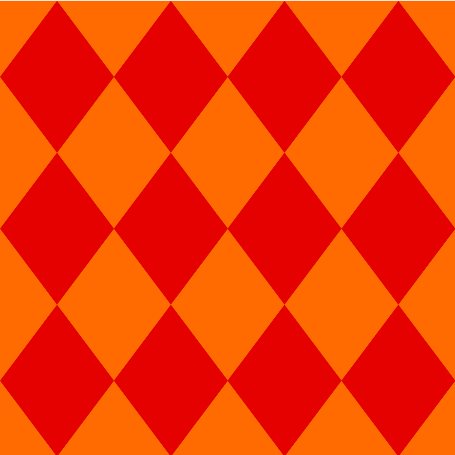

Pattern
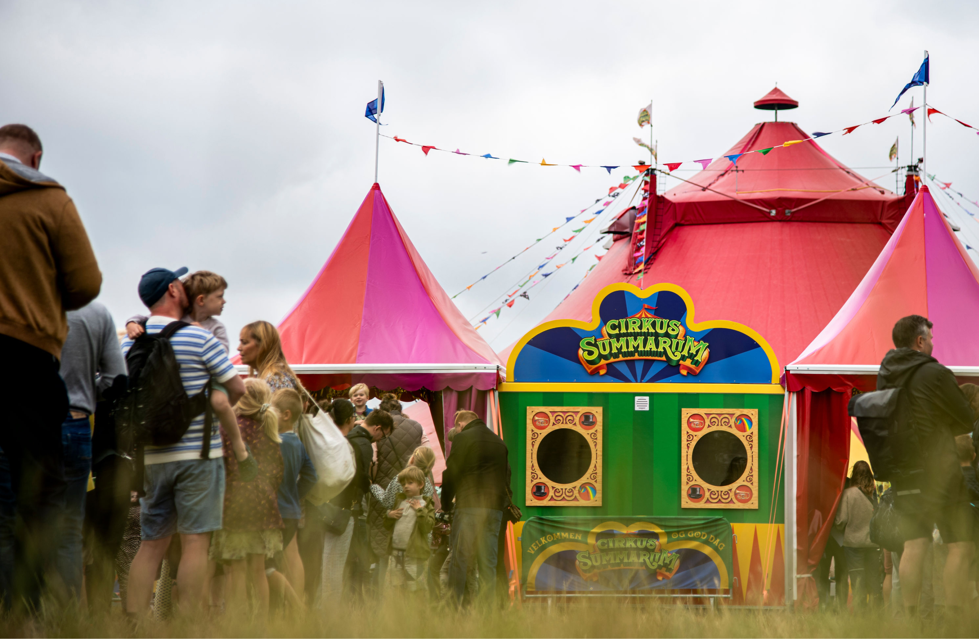
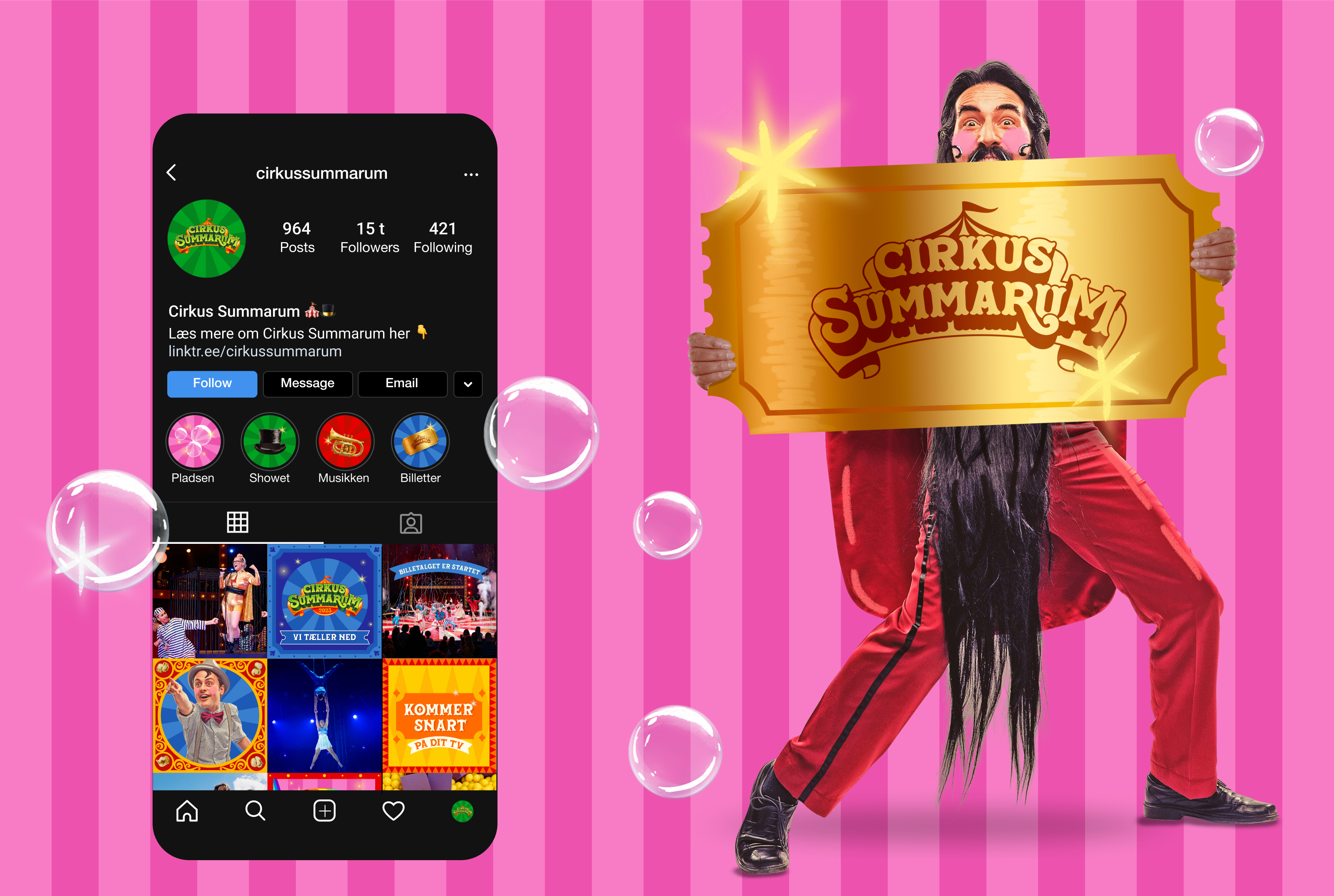
It’s rarely you get to design an identity that goes on as many touchpoints as Cirkus Summarum. Everything from popcorn buckets, tatoos, lunchboxes, huge entrances, a tent with room for 2000 people, t-shirts and the list goes on.

